Custom Engagement Solutions
Unlock tailored solutions with a free, no-obligation strategy session.
Expert Developers & Engineers on Demand
Scale Your Team with Skilled IT Professionals
Expert Guidance for Digital Transformation
Custom Engagement Solutions
Unlock tailored solutions with a free, no-obligation strategy session.
Expert Developers & Engineers on Demand
Scale Your Team with Skilled IT Professionals
Expert Guidance for Digital Transformation
Custom Engagement Solutions
Unlock tailored solutions with a free, no-obligation strategy session.
Expert Developers & Engineers on Demand
Scale Your Team with Skilled IT Professionals
Expert Guidance for Digital Transformation
Data-Driven
Success Stories
See What We Built and How it Worked!
Latest Blogs & Insights
Shopify insights that keep you ahead.
Latest News & Announcements
Milestones that push our progress to new heights
Proud to Be Recognized as a Top eCommerce Workplace
Where Global Talent Meets Shopify Brilliance
 INDIA
INDIA
 contact@cartcoders.com
7th Floor, PV Enclave, Opp. Courtyard by Marriott, Off Sindhu Bhavan Road, Bodakdev, Ahmedabad, Gujarat 380054
 USA
contact@cartcoders.com
USA
contact@cartcoders.com
5119 E Coolbrook Ave, Scottsdale, AZ 85254
 CANADA
contact@cartcoders.com
CANADA
contact@cartcoders.com
3120, Kirwin avenue Mississauga L5A3R2
 AUSTRALIA
contact@cartcoders.com
AUSTRALIA
contact@cartcoders.com
2/23 Foster Street, Surry Hills, NSW 2010 Australia.
Get in Touch with Cartcoders
We’re Here to Help You Achieve Your Goals
Global Offices & Dev Hubs
INDIA
contact@cartcoders.com
7th Floor, PV Enclave, Opp. Courtyard by Marriott, Off Sindhu Bhavan Road, Bodakdev, Ahmedabad, Gujarat 380054
USA
contact@cartcoders.com
5119 E Coolbrook Ave, Scottsdale, AZ 85254
CANADA
contact@cartcoders.com
3120, Kirwin avenue, Mississauga L5A3R2
AUSTRALIA
contact@cartcoders.com
2/23 Foster Street, Surry Hills, NSW 2010 Australia.
The subscription business model continues to grow rapidly. Your Shopify store needs to catch up, or you risk losing customers. By 2025, experts predict the worldwide subscription eCommerce market will reach $900 billion. This number indicates the magnitude of the opportunity.
A subscription landing page is a unique web page that allows ordinary visitors to become paying subscribers. Such pages do not resemble regular product pages, as they focus on the benefits a person will receive continuously, simplify choices, and remove barriers that prevent people from signing up.

When you have a Shopify subscription business, the design of your landing page is crucial. It is not something you can skip and do it later. Good design sells, retains customers, and generates good customer relationships. Here’s how you can build a one-page eCommerce website that anyone can use without trouble
The process of creating a subscription landing page is not limited to generating a subscribe button on an ordinary product page. These pages must be informative, reliable, and designed with individuals in mind who would keep returning. There are five differences between standard product pages and subscription landing pages:
People need to choose between different options like weekly, monthly, or quarterly deliveries. Show these choices clearly with easy-to-use buttons and graphics that make sense.
Being honest about money builds trust. Tell customers exactly when they’ll pay, how much it costs, and what they get with each delivery.
Don’t hide important details in small text. Clear rules about canceling subscriptions make people feel safe and more likely to sign up.
Explain why subscribing beats buying once. Show customers the real benefits they get from choosing your subscription service.
Provide customer reviews, money-back guarantees, security badges, and return policies. Such aspects make nervous customers feel confident to subscribe.

Building a subscription landing page requires planning and strategy. These proven methods come from studying customer behavior, user experience design, and conversion research. Use them correctly to get better results.
Your page header should grab attention and communicate to visitors what they can expect.
Do this:
Make your design clear and concise. Avoid confusing the visitors with increased fonts, colors, and other design elements.
Essentials:
Customers want proof that others have tried and liked your product. Social proof demonstrates your service is reliable and popular.
Add these:
Recurring orders, analytics, trials—all mapped clearly


Giving customers options increases sales. Let people see costs and benefits without searching for information.
Make sure users can:
Once you have covered the basics, enhance the performance of your page using the following methods.
Tactics to implement:
About 70% of Shopify visitors use mobile devices. If your page loads slowly or looks bad on phones, you’ll lose customers immediately.
Optimize by using:
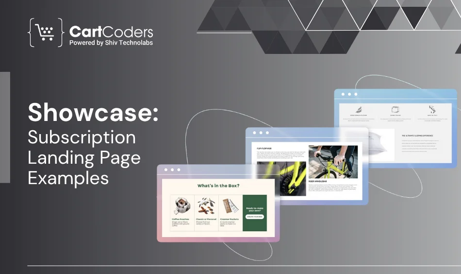
Studying successful examples helps you understand what works. These subscription landing pages show different ways to do things right:
Their design is simple, visual, and follows a clear path. They make decisions easy by keeping choices simple.
Colorful product photos combined with lifestyle images create emotional connections. Their pictures tell stories before customers read any text.
Their price chart is straightforward: “$9 monthly includes these items.” No confusion, no searching around. Just clear facts.
They use social proof throughout their page: customer comments, star ratings, and social media posts.
Their entire process works smoothly. From clicking the button to completing purchase, everything feels easy and quick.
A beautiful page doesn’t matter if it loads slowly or doesn’t appear in search results. These SEO and technical tips ensure your subscription page works well behind the scenes.
Use search keywords such as “monthly tea subscription”, “premium soap delivery” or “healthy snacks shipped monthly” in the main headings.
Every picture needs descriptive text for screen readers and search engines.
Instead of “/page-15?source=homepage” use “/monthly-coffee-subscription”.
Make large images smaller. Use delayed loading for pictures. Remove unnecessary code. Google favors fast-loading websites.
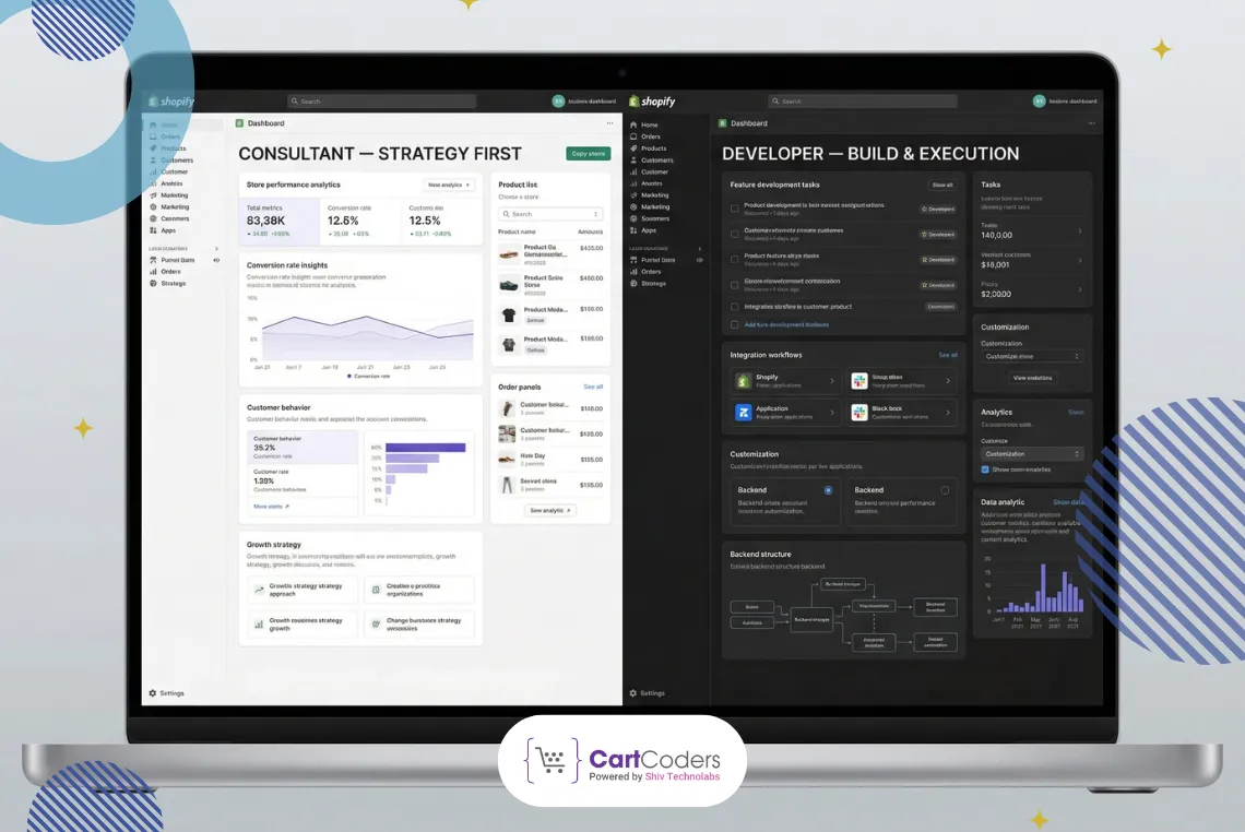
You don’t need to rebuild everything from zero. But you do need a clear plan. Here’s how to successfully redesign your Shopify subscription page:
Use tools like Hotjar, Google Analytics, and Shopify Analytics to examine:
Plan out:
Work with Shopify 2.0 themes or external builders like:
Install apps like:
Don’t publish and forget about it. Monitor:
Then adjust your design, writing, and deals based on actual customer actions.
When you’re ready to grow your subscription business, you need more than just good design—you need experts who understand your goals. CartCoders provides that expertise.
We Offer:
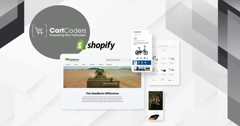
Subscription Website Development Services
Create your recurring income business with solid technical foundations and customer-focused subscription experiences.
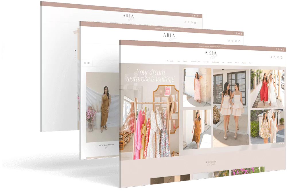
Shopify Store Redesign Services
Whether you’re starting fresh or improving an existing store, our Shopify store redesign services rebuild your site with custom landing pages designed to drive sales and improve customer retention.
What You’ll Get:
Subscription landing pages that convert visitors into customers
Complete Shopify redesign services
Easy connections with ReCharge, Loop, Skio, and other apps.
Continued support and improvements to help you grow
A subscription landing page succeeds based on performance, not just appearance. It leads people on a well-understood path of value, trust, and simplicity. Through clever design choices, you can turn occasional visitors into lifelong clients.
To recap, focus on:
Work with CartCoders to do it correctly. We mix performance, aesthetics, and strategy to produce compelling Shopify subscription experiences.
It’s a specific webpage designed to sell products or services that customers receive regularly, like weekly, monthly, or custom delivery schedules. These pages explain billing cycles, plan choices, and benefits so users feel confident about subscribing.
Start with a compelling headline, an easy-to-understand value statement, and a straightforward layout. Introduce social proof, such as customer testimonials, and enable users to compare plans easily. Make everything work well on mobile devices and focus on encouraging action.
Of course, they are necessary. They respond to general doubts regarding invoices, cancellation, or delivery time, and this enhances trust and makes your page appear more frequently in search engines (using schema markup).
The top pages stay simple: strong headline, short benefit-focused text, clear plan choices, visible customer reviews, mobile compatibility, and multiple sign-up buttons. Everything should guide visitors to subscribe without hesitation.
Test different methods — use a variety of button designs, use buttons in various places and add urgency through countdown timers. Also, make checkout easier. Fewer obstacles means more subscriptions.
Keep it organized:

Projects delivered in 15+ industries.
95% retention rate, building lasting partnerships.


Serving clients across 25+ countries.
60+ pros | 10+ years of experience.


