Custom Engagement Solutions
Unlock tailored solutions with a free, no-obligation strategy session.
Expert Developers & Engineers on Demand
Scale Your Team with Skilled IT Professionals
Expert Guidance for Digital Transformation

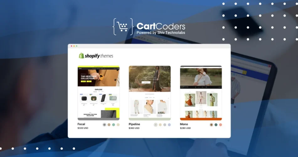
Your Shopify theme is the digital face of your store. It shapes the first impression customers get when they visit your site. A well-designed and customized theme can capture attention, make navigation smooth, and guide customers toward making a purchase.
Three elements define most of the design: images, colors, and fonts. When used thoughtfully, they can set the mood, reflect your brand’s values, and create a store that feels consistent and professional.
In this blog, we’ll cover how to customize these elements step by step, along with tips to avoid common mistakes. By the end, you’ll have a clear idea of how to bring your Shopify store’s design closer to your brand vision.
Shopify offers free and paid themes that look great out of the box, but using the default design means your store might look similar to others. Customization allows you to:
In short, a personalized theme is not just about beauty—it directly impacts how customers interact with your store.

Images carry the most visual weight in any store. They show what you sell, explain features, and trigger emotions. Adding or updating them in Shopify is straightforward:
Quick tip: Stick to the same style across images. If your product photos use a white background, keep it consistent for all products.
Large, high-quality visuals look impressive, but oversized files can slow your site down. Shopify themes work best with specific image sizes.
Here’s a simple reference:
| Image Type | Recommended Size | Purpose |
| Hero banner | 1200px – 2000px wide | Creates a strong first impression |
| Product images | 800px – 1000px square | Shows product details clearly |
| Collection banner | 1600px wide, flexible height | Highlights a category visually |
| Thumbnails | 300px – 500px | Quick previews in lists or grids |
Before uploading, compress your images with tools like TinyPNG or Squoosh. Compressed images keep file sizes small without losing visible quality.
Always preview your store on desktop and mobile—an image that looks sharp on a large screen might appear cropped on a phone.

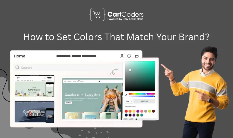
Colors are more than decoration—they communicate emotions and influence decisions. Shopify allows you to adjust your store’s color palette easily:
A balanced palette keeps your store easy to read and attractive. Some tips:
Here’s an example of a palette structure:
| Element | Color Choice Example | Role in Design |
| Primary color | #1E73BE (blue) | Brand identity, headings |
| Secondary color | #F4A300 (orange) | Highlights, category banners |
| Accent color | #000000 (black) | Buttons, CTAs |
| Neutral background | #FFFFFF (white) | Base for readability |
Contrast is key. If the text color and background are too similar, many users will struggle to read. Free online tools like WebAIM’s Contrast Checker can help test combinations before finalizing them.
Typography sets the tone of your brand voice. A playful font suggests casual style, while a clean sans-serif shows professionalism. To change fonts:
Here are some strong font pairings:
Your font choice must work on all screen sizes. Recommended sizes:
Keep line spacing between 1.4–1.6 for comfortable reading.
If you want design changes that theme settings don’t allow, custom CSS can help. For example, you may want rounded buttons, unique hover effects, or specific spacing adjustments.
Steps:
.button {

  border-radius: 10px;

  font-size: 16px;

  background-color: #1E73BE;

}
⚠️ Always back up your theme before editing code. Mistakes in CSS can break your store’s layout.
Even with customization tools, some mistakes can reduce store performance or hurt design consistency. Here are a few to watch out for:
DIY customization works for many store owners, but advanced changes can require professional help. Some examples include:
This is where CartCoders comes in. Our Shopify developers specialize in theme customization, making sure images, colors, and fonts come together in a way that reflects your brand while keeping performance high.
👉 Check out our Shopify development services.
Customizing your Shopify theme is about creating a store that looks good and feels aligned with your brand. Images show your products in their best light, colors create emotional connection, and fonts guide customers through content smoothly.
Small changes in these elements can have a big impact on how customers see your store and whether they complete a purchase. If you want professional support to make your theme stand out, contact CartCoders.
Projects delivered in 15+ industries.
95% retention rate, building lasting partnerships.
Serving clients across 25+ countries.
60+ pros | 10+ years of experience.