Hop onto any street, and you’ll see stores flaunting their distinct personalities. The same goes for online avenues. If you’ve landed on Shopify for your e-commerce dreams, kudos!
Over 4.12 million businesses are currently using Shopify. But remember, making it stand out is key, and we’re here to guide you on how to paint your Shopify store in colors, fonts, and images that scream “YOU.”
Importance of Personalizing Your Store
With the e-commerce world expanding at breakneck speed, being just another brick in the wall won’t do. Let’s break down why putting a personal touch on your Shopify store is a real game-changer:
Unique Vibe:- Giving your store its own groove helps you dance out of the crowd. Your brand gets its own voice, making it memorable for those who drop by.
Higher Conversions:- A site that clicks with visitors keeps them around. Little touches, like suggesting products they might love, can softly lead them down the purchase path.
Loyalty and Trust:- When shoppers feel you’ve rolled out the red carpet just for them, they’re more likely to come back for an encore. Custom content, suggestions, and designs that speak to them can work wonders for loyalty.
Reduced Bounce Rates:- An engaging store can be like that gripping novel you can’t put down. If visitors vibe with how you present things, they’ll stick around to explore.
Better SEO and Visibility:- Tailored content can become a magnet for your target group. When search engines see the buzz, your SEO can get a nice little boost.
Customizing with Images
There’s a resonating truth in the adage, “An image speaks louder than words.” Especially in the e-commerce realm, the apt visuals can translate to impressive sales figures.
Here’s your guide to artfully infusing your Shopify storefront with striking visuals:
Selecting The Perfect Image:
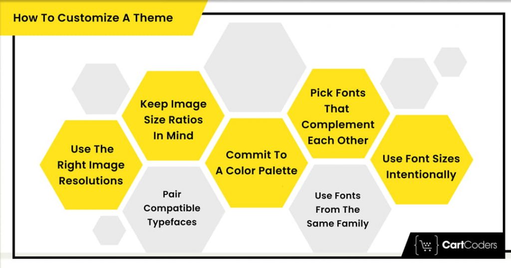
Crisp and Clear:- Your first bet should always be on sharp, high-quality images. The precision of an image mirrors your store’s dedication to quality.
Alignment with Content:- Ensure every visual serves a purpose. It should align seamlessly with the content, product, or idea on display. An out-of-place image can leave a visitor puzzled.
Consistent Style:- To craft a recognizable brand persona, it’s vital that your visuals maintain a consistent vibe. This could span across lighting nuances, applied filters, composition, or the chosen subjects. Such continuity fosters a sense of trust.
Implementing Images on Shopify:
Showcasing Products:
All-Around Views:- Flaunt your merchandise from multiple perspectives. This all-encompassing view mimics the tactile experience of brick-and-mortar stores.
Zoom-in Capabilities:- Zoom-ins can be the heroes. They let customers spot and appreciate the nitty-gritty of products.
Contextual Shots:- Use images that show the product in daily life. It’s like giving visitors a sneak peek into how it fits into their world.
Hero Images:
Storytelling:- The banner or main image on your landing page is typically a newcomer’s first visual handshake with your brand. Employ this space to weave your brand’s narrative or spotlight a star product.
Magnetic Visuals:- Go all out with rich, captivating images that latch onto the viewer’s attention from the get-go.
Smooth CTA Blend:- Smartly weave in a call-to-action in proximity to the central image, nudging the visitor along their journey.
Content and Blogs:
Pictorial Relevance:- Studies suggest posts enriched with relevant images enjoy a whopping 650% higher engagement as compared to text-only posts. Sprinkle your write-ups with high-quality, pertinent photos to keep things lively and enhance reader interaction.
Info-Graphics:- A master tool for simplifying complex data or workflows. They’re shareable, which can increase the reach of your content.
Diving into Color Dynamics
Colors go beyond mere aesthetic choices for your store; they’re potent communicators, shaping the ambiance and essence of your digital presence. Picking the right set of colors can ignite emotions, guide choices, and even shape views about the character of your brand.
Understanding Color Psychology:
Blue:- A symbol of trustworthiness and serenity. Tech and financial sectors adore it for its business-like charm. Soft blues are relaxing, while the deeper ones exude confidence.
Red:- A bold and lively hue that instantly captures attention. Perfect for CTAs like ‘Grab Now’ or ‘Discount’, it radiates urgency and significance.
Yellow:- A representation of joy and warmth. Though it’s great at catching eyes, moderation is key. Its excessive use can be overwhelming and even perceived as too assertive.
Green:- The all-rounder color, standing for health, peace, and the environment. It echoes growth and optimism. Pastel greens feel organic and airy, while their darker counterparts are plush and grown-up.
Black and White:- While black spells elegance and class, white portrays minimalism and purity. Their combo is evergreen and always stylish.
Purple:- A hue that speaks of affluence, intellect, and innovation. Soft lilacs are therapeutic, while the profound purples give off an opulent vibe.
Implementing Colors on Shopify:
Background Color:
Neutral Shades: Preferences lean towards muted whites, grays, or beiges for a pristine canvas that spotlights the content.
Theme Harmony: Your foundational color should mesh well with other elements, bringing a harmonious theme to the fore.
Accent Colors:
Highlights: Bold, standout colors can underscore key details like discounted rates or fresh collections.
Navigation and Actions: Vivid, catchy colors can steer users towards actions like ‘Put in Basket’ or ‘Join Now’.
Text Color:
Contrast is Key:- For maximum clarity, opt for deeper shades against light backgrounds. Think classic black text against a stark white backdrop.
Layering:- Play with shades to create a content hierarchy order, setting headers in a more dominant shade than the main content.
Your chosen typeface can evoke feelings, set moods, and even determine how information is consumed on your site:
Understanding Font Psychology:
Serif Styles (like Times New Roman):- Fonts with tiny extensions or strokes at letter ends radiate age-old values, trustworthiness, and class. Ideal for brands with a refined, timeless vibe.
Sans-Serif Varieties (like Helvetica):- These modern, neat fonts devoid of frills are a hit online, especially among tech-savvy brands.
Cursive Styles (like Pacifico):- Resembling manual scripts, these fonts feel intimate, imaginative, and plush. Best reserved for attention-grabbing headers or logos.
Decorative Types (like Bebas Neue):- Crafted for limited text use, they’re distinctive and can stir strong sentiments, fitting for brand marks and top headers.
Implementing Fonts on Shopify:
Readability First:
Sizing:- Ensure fonts are easily discernible across gadgets. For standard web content, 16px for font is a general thumb rule.
Breathing Space:- Adequate line gaps are crucial. Dense text can be uninviting and strenuous to read.
Font Pairing:
Balancing:- Pair fonts that have a harmonious yet distinct feel. A common method is blending a serif title font with a sans-serif content font.
Choose Wisely:- Overloading with varied fonts can be visually jarring. Limit yourself to a trio at most: one for titles, another for content, and maybe a special one for CTAs or standout points.
Collaborate with Experts: The Unique Edge of CartCoders
Crafting an online store goes beyond looks—it’s about a seamless shopping experience. Navigating Shopify’s vast tools can be tricky without tech expertise, that’s when CartCoders, professional Shopify experts, step in.
We are not just Shopify experts; we have witnessed the e-commerce evolution. Our approach? We understand your brand deeply and offer customized digital solutions.
Our team doesn’t just focus on the shop’s look but its overall functionality, ensuring smooth transitions from concept to launch. Beyond visuals, we assist with app integrations, SEO, and post-launch support. If you aim for a unique, efficient, and user-centric store, CartCoders is the ally you need.
Conclusion
Revamping your Shopify appearance with vibrant images, hues, and typography can dramatically uplift the user journey, mirroring your brand’s persona and potentially driving up sales. Whether you’re diving solo or seeking expert help, the key is to remain consistent, user-focused, and always open to feedback and improvement.
And if you ever need assistance in developing your Shopify store truly stand out, remember – CartCoders is here to help! Visit our website to learn more or book a consultation. Your dream store is just a click away.
As the CTO at Shiv Technolabs & CartCoders, I am liable for instigating, planning, integrating, and implementing the organization's strategic orientation.
I gather the most significant tech news in addition to sharing the information I gained while serving as the CTO of Shiv Technolabs, a renowned web and mobile app development company. I am pleased to answer questions as a most valuable expert for Shiv Technolabs Private Limited and to share my experience. I offer a keen insider's perspective on technical advancements.