
Your Shopify store design shapes the first impression visitors get when they open your site. A clear and well-structured store design helps users understand what the store offers, find products quickly, and move forward without confusion. When the design feels easy to follow, visitors are more likely to stay and browse.
Many Shopify stores face issues not because of their products, but because the layout feels crowded, navigation is unclear, or pages do not work well on mobile devices. Even small design gaps can cause users to leave before taking any action.
This guide covers eight practical design tactics that focus on clarity, usability, and smooth shopping flow. Each tactic is explained in simple terms to help store owners create a better experience for their visitors.


Why Design Plays a Key Role in Shopify Store Success?
Design affects how visitors interact with a Shopify store from the first click to checkout. It is not only about appearance, but also about how easily users can move through pages and complete actions.
A clear design helps users feel comfortable and in control while browsing. When pages feel simple to read and use, visitors stay longer and check more products.
Key ways design supports store success
- Helps visitors understand the store structure quickly
- Makes product discovery easier
- Reduces confusion during browsing and checkout
Good design also guides users step by step. Clear menus, readable text, and proper spacing help shoppers move from the homepage to product pages without effort.
Design also builds trust
- Clean layouts feel more reliable
- Clear product information reduces doubt
- Consistent visuals create familiarity
When a store feels easy to use, visitors are more likely to continue browsing and complete their orders. This makes design an important part of the overall Shopify store performance.
Design Tactic #1: Clean and Structured Store Layout
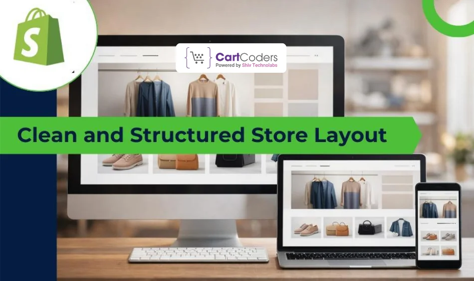
A clean store layout makes it easier for visitors to understand your Shopify store at a glance. When pages feel organized, users can focus on products instead of trying to figure out where to look.
A structured layout helps content flow in a natural order. Important sections like banners, product listings, and key messages should appear where users expect them.
Why a clean layout works
- Reduces visual overload
- Keeps attention on products
- Makes pages easier to scan
Proper spacing between sections also matters. When content is packed too closely, pages feel heavy and difficult to read. White space helps each section stand out and improves readability.
Layout tips for better clarity
- Use clear sections for each purpose
- Avoid adding too many elements to one page
- Keep design consistent across all pages
A clean and structured layout creates a smooth browsing experience and helps users stay focused while shopping.
Design Tactic #2: Simple and Clear Navigation
Navigation helps visitors move through your Shopify store without confusion. When menus are clear, users can reach products and important pages quickly.
A good navigation structure feels familiar. Visitors should understand where each link leads without guessing.
What makes navigation effective
- Clear and easy menu labels
- Limited number of main menu items
- Logical grouping of product categories
Simple navigation reduces effort for users. When they can move between pages easily, they are more likely to keep browsing.
Helpful navigation elements
- A visible search bar for quick access
- Footer links for support and policy pages
- Breadcrumbs on product and collection pages
Clear navigation keeps users oriented and helps them find what they need without frustration.
Design Tactic #3: Mobile-First Store Design
Most shoppers visit Shopify stores using their phones. If the store does not work well on smaller screens, users often leave without browsing further.
A mobile-first approach means planning the design for phones before adjusting it for larger screens. This helps keep layouts simple and content easy to read.
Why mobile design matters
- Small screens need clear spacing
- Touch actions require larger buttons
- Text must stay readable without zoom
Mobile users expect smooth scrolling and fast loading. When pages load slowly or buttons are hard to tap, the shopping experience feels frustrating.
Mobile design best practices
- Use large and clear action buttons
- Keep content in short sections
- Avoid pop-ups that block the screen
A store that works well on mobile keeps users engaged and supports a better shopping flow.
Build a Store Users' Trust
Strong visuals and clear pages help shoppers feel confident while buying.


Design Tactic #4: High-Quality Product Images
Product images play a major role in online shopping decisions. Since users cannot touch or try products, images help them understand what they are buying.
Clear and well-lit images make products feel more reliable. When visuals look sharp and consistent, users feel more confident while browsing.
Why good images matter
- Help users judge product quality
- Reduce hesitation before buying
- Create a professional store appearance
Showing products from multiple angles gives users a better view. Zoom features also help shoppers check details without leaving the page.
Image best practices
- Use the same style for all product images
- Keep backgrounds clean and simple
- Avoid low-resolution or stretched visuals
Strong product images make browsing easier and support better buying decisions.
Design Tactic #5: Strong Trust Elements on Key Pages
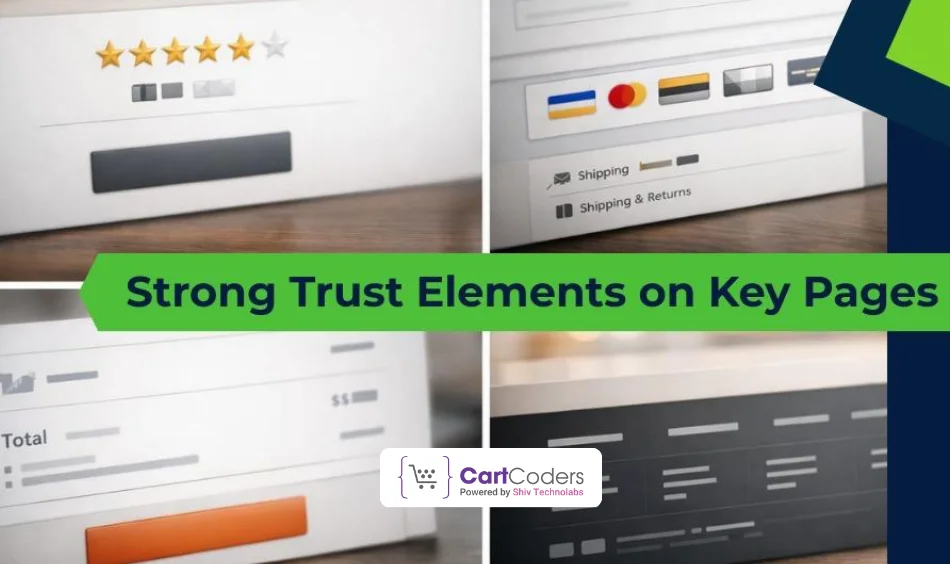
Trust plays a major role in online shopping. Visitors often decide whether to continue or leave based on how reliable a store feels.
Clear trust elements help reduce doubt, especially for first-time visitors. These elements should be easy to notice without interrupting the shopping flow.
Common trust elements that help
- Customer reviews and ratings
- Secure payment and checkout icons
- Clear shipping and return details
Placing trust signals near product prices and checkout areas reassures users at the right moment.
Where trust elements work best
- Product pages
- Cart and checkout pages
- Footer and support sections
When visitors feel confident about the store, they are more likely to complete their orders and return again.
Design Tactic #6: Clear and Helpful Product Pages
Product pages are where buying decisions are made. If information feels confusing or hard to find, users may leave without adding items to the cart.
A clear product page helps users understand the product quickly. Important details should be visible without excessive scrolling.
What a strong product page includes
- Short and clear product titles
- Key features listed in bullet points
- Easy-to-find price and availability
Readable content makes a difference. Long paragraphs can overwhelm users, while short sections keep attention.
Helpful design practices
- Keep product details structured
- Place important information near the top
- Use clear spacing between sections
Well-organized product pages make shopping easier and help users feel confident about their choices.
Design Tactic #7: Clear Call-to-Action Placement
Call-to-action buttons guide visitors toward the next step, such as adding a product to the cart or moving to checkout. When these buttons are easy to spot, users act without hesitation.
Clear placement helps users understand what to do next. Buttons should stand out but still match the overall store design.
What makes a CTA effective
- Simple and direct button text
- Consistent button style across pages
- Enough contrast to stay visible
Buttons placed too low or hidden among other elements often get ignored. Keeping them within easy reach improves interaction.
CTA placement tips
- Place main buttons above the fold
- Avoid multiple primary actions on one page
- Keep spacing around buttons clear
Clear call-to-action placement helps guide users smoothly through the shopping journey.
Design Tactic #8: Simple and Focused Checkout Flow
Checkout is the final step of the shopping journey. If this stage feels confusing or time-consuming, users often abandon their carts.
A focused checkout keeps attention on completing the order. Removing extra elements helps users stay on track.
Why a simple checkout works
- Reduces hesitation before payment
- Saves time for users
- Lowers cart abandonment
Checkout pages should show only what is needed to place an order. Extra links, banners, or messages can distract users at this point.
Checkout design best practices
- Keep form fields limited
- Show a clear order summary
- Avoid unnecessary visuals
A clean checkout flow helps users complete purchases with confidence and less effort.
Common Shopify Design Mistakes to Avoid
Even well-built Shopify stores can struggle if design mistakes get in the way of user experience. These issues often cause visitors to leave before browsing products or reaching checkout.
Some design problems appear small but have a strong impact on how users feel while shopping.
Common mistakes seen in Shopify stores
- Pages filled with too many elements
- Confusing navigation or unclear menu labels
- Text that is hard to read on mobile screens
Inconsistent design across pages can also confuse users. When layouts, colors, or button styles change often, the store feels unreliable.
Other design issues to watch for
- Low-quality or mismatched product images
- Important information is placed too far down the page
- Checkout pages with too many steps
Avoiding these mistakes helps create a smoother shopping experience and keeps users engaged longer.
How a Well-Planned Design Supports Store Growth?
A well-planned design helps a Shopify store grow by making shopping easier and more comfortable for visitors. When users enjoy the experience, they are more likely to return and spend more time on the site.
Good design supports a clear user flow. Visitors can move from browsing to product pages and then to checkout without confusion or extra effort.
Ways design supports long-term growth
- Keeps visitors engaged for longer sessions
- Helps users find products faster
- Reduces friction during checkout
Consistency across pages also matters. When layouts and visuals feel familiar, users trust the store more and feel confident placing orders.
Design helps beyond first-time visits
- Encourages repeat customers
- Improves overall store usability
- Supports steady order completion
A store built with clarity and usability in mind creates a strong base for steady growth.
Why Choose CartCoders for Shopify Store Design?
A Shopify store should feel easy to use, clear to understand, and comfortable for shoppers at every step. From layout planning to product page structure and checkout flow, each design decision affects how users interact with the store.
CartCoders works on Shopify store design with a strong focus on clarity and user behavior. The approach is practical—keeping navigation simple, pages well-structured, and mobile users in mind. The goal is to create stores that help visitors find products faster and complete orders without friction.
If you are planning to improve your Shopify store design or rebuild it with a clear structure, the right design support can make a noticeable difference in how users engage with your store.
Conclusion
Design plays a direct role in how users interact with a Shopify store. From the first visit to checkout, clear layouts and simple structure help visitors feel comfortable and confident while shopping.
Each of the eight design tactics discussed in this guide focuses on making the store easier to use. Clean layouts, simple navigation, mobile-friendly pages, clear product details, and a focused checkout all work together to improve the shopping experience.
When design choices are made with clarity and usability in mind, a Shopify store becomes easier to browse and easier to buy from. This creates better engagement and supports steady store performance over time.


