The current digital environment is mobile-based, with more than 55% of all website visits globally from mobile devices and smartphone penetration is on the rise each year. A mobile-first web design strategy implies creating an interface and development based on the smallest screens rather than reducing the desktop layout to a smaller size.
Create Responsive Ecommerce Store With Smooth User Flow
Clean layouts that work perfectly on all screens.
This strategy is evident in the fact that mobile users need speed, clarity, and a smooth user experience, and search engines are starting to rank results that offer a mobile experience higher. In this article, you will learn what mobile-first web design entails, its functionality, when it is required, and how it has helped facilitate search engine optimization, interactions, and conversions.
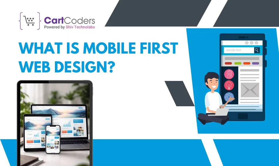
What Is Mobile First Web Design?
Mobile-first web design is the practice of creating a website so that the mobile version is built first for small screens, then scaled up to tablets and desktops.
Mobile-first design reverses the process, unlike the traditional design workflow, which starts with a desktop layout. The rationale here is straightforward: the majority of users are on phones and hence design decisions must be made for mobile screens and then extended to other larger devices.
This means:
Layout decisions begin with the mobile screen.
Everything in the structure is mobile-focused.
The desktop version is not the first one to be built.
How Does Mobile-First Web Design Work?
Knowing how mobile-first web design works, a person may simply say that the approach to design decisions is top-down, starting with small screens and moving to large ones, focusing on clarity, speed and touch interfaces.
The following is the actual workflow, basic, organized and employed by the contemporary UI/UX teams.
1. Content Planning for Small Screens
Every pixel counts on mobile. The initial step is to establish the fundamental content that has to be visible above the fold, headline, CTA, product/service value, form, menu and key actions.
Designers remove the unneeded content and emphasize high-intention content. Adding secondary content is done when space permits.
2. Layout Structure Designed Around Touch
Mobile users interact with thumbs, not mouse cursors. Layout planning must consider:
44–48px tappable areas
Easy interventions between actions.
Vertical scroll patterns
Preventing edge-based interactions.
Large text contrasts
This prevents users from mis-tapping, having difficulty scrolling, or zooming to view.
3. Navigation Built for Thumbs
The mobile navigation should be minimal and intentional. The most effective three patterns are:
Hamburger menus
Bottom navigation bars
Sticky call/menu/cart buttons.
The idea is straightforward: users should be able to find any page in 2-3 taps without getting disoriented.
4. Visual Hierarchy for Limited Space
Mobile screens do not have room for clutter. Visual Hierarchy is necessary:
One activity at a time.
Small paragraphs + type that is easy to read.
Crystal sequence of ingredients.
Strong contrast + whitespace
Designers create hierarchy based on weight, size, color, spacing and placement- never hovering as there is no hover state in mobile.
5. Scaling Up for Tablets & Desktops
When mobile is right, layouts get bigger:
More columns
Larger images
Richer footers
Expanded navigation
Additional supporting material.
Layouts in multi-steps to use by a desktop user.
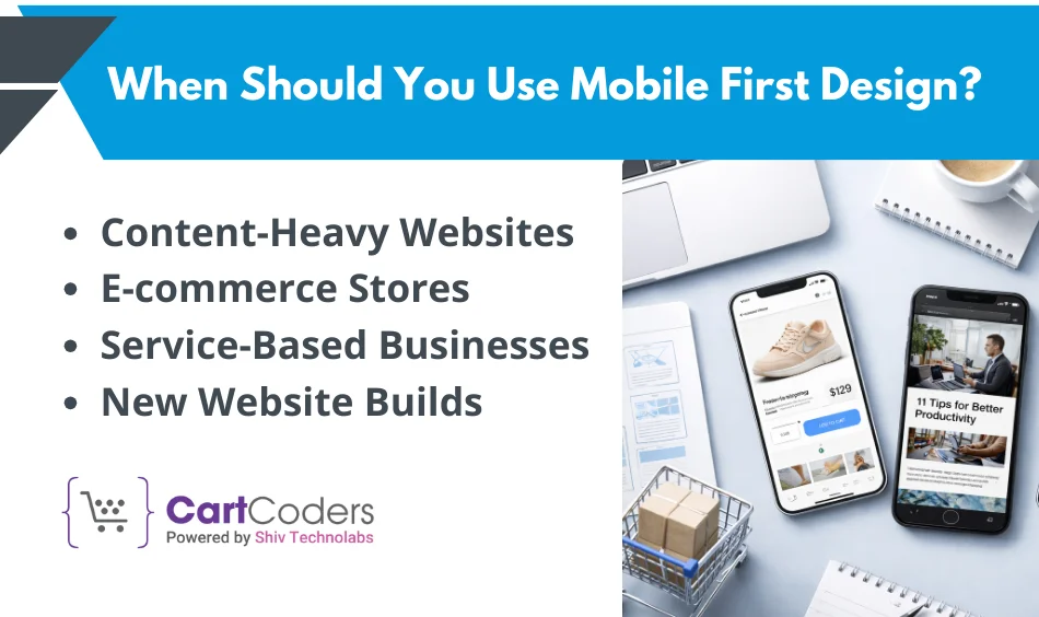
When Should You Use Mobile First Design?
Mobile-first is logical as long as mobile performance directly affects business objectives: traffic, engagement, conversions, or brand perception.
Content-Heavy Websites
Articles, resources and other forms of longer content make sites better suited to mobile-first design, since they entail hierarchical clarity. Breaking down content into chunks, designing sticky headers and controls that are easy to use by thumb can guarantee the reader to be more engaged.
E-commerce Stores
Traffic to e-commerce is increasingly mobile, with 60%+ of visits. Mobile is a great place to begin because it ensures product pages load quickly, filters are simple and the checkout process is seamless, which is essential for reducing cart abandonment and increasing profits.
Service-Based Businesses
In the case of consultations, bookings and lead generation, mobile-first will ensure phone calls, contact forms and service information are displayed prominently on-screen, enabling low-friction conversions.
Talk To Experts About Responsive Ecommerce Development
Discuss layouts, breakpoints, and mobile behavior.
New Website Builds
Mobile-first means that when a new site is introduced, no retrofitting or rework is required to make changes, saving time and cost.
Situations Where It Makes the Most Sense
Big mobile traffic – > 50% of the visits are phone-based.
New audience targeting – engaging smartphone-only users.
Speed and usability – enhancing Core Web Vitals and user experience.
Is Mobile First Design Necessary?
Mobile usage is on the increase and thus the need to consider it at an early stage of designing the process.
Why Many Websites Now Follow This Approach
User trend change: users spend more time on mobile than on desktop.
Patterns of device use: small screens require other forms of interaction.
Website expectations from visitors: instant load, clear CTAs, simple navigation
Restrictions imposed by mobile devices can be met initially, resulting in a less polluted, faster and more usable experience, regardless of screen size.
What Happens If You Skip Mobile First
Problems with usability – too small buttons, content truncated.
Better bounces- sluggish and congested interfaces lose customers.
Bad interaction on small screens – people abandon it before they can communicate.
Not being mobile-first does not save time; instead, it tends to create extra work and lead to lower conversion rates.
Does Mobile First Design Affect SEO?
Mobile-first and SEO are closely related, particularly because Google uses mobile versions of pages to index and rank content.
Connection with the Indexing System of Google
Google switched to mobile-first indexing, meaning search engines look at your mobile version of the site. Without a mobile experience, SEO performance is harmed, even on desktop search.
SEO Benefits of Mobile First Design
Improved page experience with better Core Web Vitals.
The mobile-first design inherently enhances page speed and navigation, both of which are ranking factors.
Common SEO Mistakes to Avoid
Obfuscating mobile content – search engine sees what it sees.
Ineffective mobile navigation – blocks crawl paths.
Large designs on small screens- slow down loading speed.
The design has to be mobile-first and accessible.
Who Should Use Mobile First Web Design?
Mobile-first is not just a UX buzz; it is a current requirement for both users and search engines.
Mobile-first web design should be used in businesses where the mobile audience is important, an ecommerce objective is pursued, speed is a priority, or conversion is a desired outcome.
Business Types That Benefit the Most
Startup: Lean teams receive increased early interactivity.
Mobile users: the majority of sales in online shops.
Service providers: mobile interaction increases calls and leads.
Publishers of content: more convenient on phones.
Mobile first enhances satisfaction in these categories and minimizes friction.
Teams That Should Follow This Approach
Designers: develop easy-to-use UI/UX.
Developers: write responsive, performant code.
Business owners: convert people.
Marketing teams: better SEO and involvement.
Mobile puts teams at the center of the main priorities: speed, clarity and performance.
Conclusion
Mobile-first web design is no longer a luxury; it is necessary to engage, drive conversions, and achieve SEO success. The designers ensure faster, cleaner and more intuitive experiences by prioritizing mobile screens, which are then scaled up to larger screens. What has been achieved is a site that is device-friendly, enhances user satisfaction and meets business objectives, such as discovery-to-conversion.
Our team at CartCoders focuses on mobile-first design and development of user interfaces and experiences – in particular, high-growth brands that need Shopify design services USA, ecommerce scalability and search engine optimized experiences. Mobile-first should be the focus of your strategy, no matter whether you’re launching a new site or redesigning an existing one.
Are you about to make your site mobile? CartCoders offers mobile-first design and implementation, turning phone traffic into loyal customers.
Frequently Asked Questions
Is mobile-first design equivalent to responsive design?
No, mobile-first design is a design process that starts with mobile and moves to desktops. Responsive design is the ability to dynamically adapt designs to different screen sizes. Responsive techniques are used in mobile-first design, although not every responsive website undergoes a mobile-first process. CartCoders develops them performance-wise.
Are old websites able to be redesigned to be mobile-first?
Yes, old sites can be reformatted using a mobile-first strategy. This usually entails reconsidering designs, increasing faster processes, and focusing on mobile content. CartCoders is able to audit your existing site and work on it to be more mobile and easier to use as well as more searchable.
Is mobile-first design more conversion-affirming?
Absolutely, Mobile-first design results in increased engagement and conversion rates because it reduces friction as load times decrease, navigation becomes easier, and the call-to-action is prominent. The performance improvements businesses achieve through mobile-first UI/UX are often measurable.
Does mobile-first design work with desktop users?
Yes, mobile-first design will provide a strong base to all devices. When the mobile experience is optimized, the same can be scaled to tablet and desktop to provide more detailed layouts, richer imagery, and more features without affecting the performance.
As the CTO at Shiv Technolabs & CartCoders, I am liable for instigating, planning, integrating, and implementing the organization's strategic orientation.
I gather the most significant tech news in addition to sharing the information I gained while serving as the CTO of Shiv Technolabs, a renowned web and mobile app development company. I am pleased to answer questions as a most valuable expert for Shiv Technolabs Private Limited and to share my experience. I offer a keen insider's perspective on technical advancements.
 eCommerce
Solution
eCommerce
Solution


 INDIA
INDIA

 USA
USA
 CANADA
 AUSTRALIA


