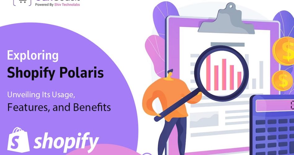
Introduction
In the ever-evolving world of e-commerce, user experience (UX) stands as a cornerstone for success. As online merchants compete to attract and retain customers, a seamless, intuitive, and visually appealing interface has become non-negotiable.
This is where Shopify Polaris steps onto the stage. In this blog, we will delve into the depths of this trending topic – Shopify Polaris, uncovering its usage, features, and the plethora of benefits it offers to both developers and merchants.
What is Shopify Polaris?
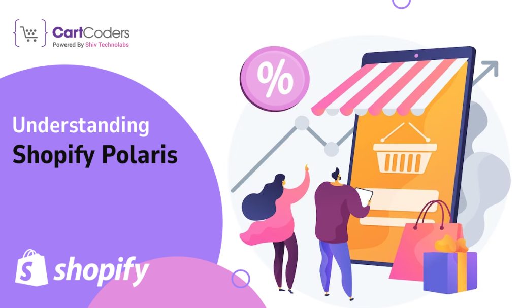
Before we dive into the specifics, let’s understand what Shopify Polaris is all about. In simple terms, Shopify Polaris is a design system created by Shopify to ensure a consistent and user-friendly experience across all their products and services.
This design system encompasses various guidelines, UI components, and best practices that help Shopify developers and designers create apps that align with Shopify’s brand identity and enhance the user experience.
The roots of Shopify Polaris can be traced back to the realization that a unified design language can significantly impact user interactions. With Polaris, Shopify aimed to provide a consistent, intuitive, and accessible design framework.
It streamlined the user journey across various touchpoints, whether it’s a merchant dashboard, a checkout process, or any other interaction within the Shopify ecosystem.
The Usage of Shopify Polaris
At its core, Shopify Polaris serves three primary purposes:
1. Implementing a Consistent Design Language
Consistency is key when it comes to building a recognizable and trustworthy brand. By adopting Polaris, developers and designers can ensure that their apps adhere to a unified design language that aligns with Shopify’s overall brand identity.
This not only reinforces the brand but also helps merchants feel more comfortable and confident using different Shopify apps.
2. Enhancing User Experience
Shopify Polaris places a strong emphasis on user experience by offering intuitive navigation, familiar UI patterns, and thoughtful design principles. With Polaris, merchants can seamlessly navigate through different apps without the need to relearn each app’s unique interface.
Also Read:- 10 Best Shopify Themes for Beauty/Cosmetics Products
This familiarity reduces the learning curve for new users and contributes to a more positive overall experience.
3. Reducing Development Time and Effort
Building UI components and designing interfaces from scratch can be time-consuming. Polaris provides a library of pre-built UI components and design guidelines that developers can readily integrate into their apps.
This allows them to focus more on the functionality of their apps rather than spending extensive time on designing every element.
Features of Shopify Polaris
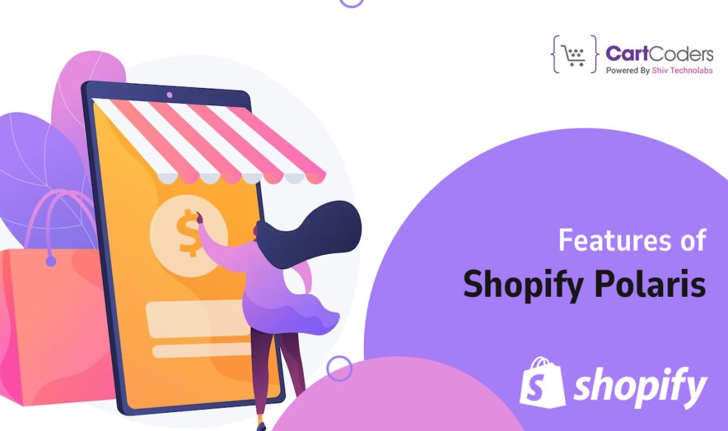
Shopify Polaris is built upon a set of design principles that shape the entire system:
- Clarity and Simplicity:- Polaris emphasizes clear and simple design choices. This ensures that merchants can quickly understand the interface and perform tasks without confusion.
- Empathy for the Merchant:- The system is designed with merchants in mind, focusing on their needs and pain points. This leads to interfaces that are not only user-friendly but also address the unique challenges merchants face.
- Accessibility for All Users:- Shopify Polaris follows accessibility best practices to ensure that all users, including those with disabilities, can interact with the platform effectively. This commitment to inclusivity aligns with web content accessibility guidelines (WCAG).
When it comes to user interface, Shopify Polaris is all about providing a diverse set of components that can effortlessly blend into your apps:
- Buttons, Forms, and Input Fields:- Standardized buttons, form elements, and input fields that stay consistent across all sorts of apps. This feature ensures that merchants won’t get confused over unfamiliar designs.
- Typography and Text Styling:- Typography and text styles are always on point, making sure your app is a seamless extension of your brand. No matter what device your customers use, the legibility will be spot-on.
- Icons and Imagery:- Polaris offers a set of icons and imagery that can be used to enhance app interfaces, creating visual cues that guide merchants through their interactions.
Guidelines That Keep The Design Flowing
- Color Palettes and Theming:- Polaris isn’t just about buttons and fonts. It’s like a personal stylist for your app, suggesting color palettes and theming options that blend perfectly with Shopify’s branding. The result? Your app feels like a natural part of the Shopify family.
- Layout and Spacing Recommendations:- Your app will be both easy on the eyes and a breeze to navigate, making your users feel right at home owing to consistent layout and spacing guidelines.
- Responsive Design Considerations:- Polaris creates interfaces that adapt seamlessly to screens of all sizes. Your app will look fantastic on a tiny smartphone screen and a spacious desktop monitor alike.
Benefits of Shopify Polaris
The adoption of Shopify Polaris brings forth a range of benefits:
Consistency in Design
With Polaris, developers can build apps that are visually aligned with Shopify’s brand, promoting a unified and trustworthy presence. This consistency is particularly valuable when merchants use multiple Shopify apps.
Also Read:- Shopify Expert Cost for Multi Vendor Marketplace
Improved User Experience
Polaris’s focus on intuitive navigation and familiar UI patterns enhances the overall user experience. Merchants can seamlessly transition between different apps without feeling disoriented, which ultimately leads to higher user satisfaction.
Time and Cost Efficiency
By utilizing pre-built UI components and design guidelines, developers can significantly reduce the time and effort spent on designing interfaces. This allows them to allocate more time to perfecting the functionality of their apps.
Accessibility and Inclusivity
Shopify Polaris’s commitment to accessibility ensures that apps are usable by a wider range of users, including those with disabilities. This not only aligns with ethical considerations but also opens up your app to a larger audience.
Real-world Examples
To grasp the impact of Shopify Polaris, let’s consider a real-world scenario. Imagine a merchant who uses multiple Shopify apps for different aspects of their online store: inventory management, marketing, and customer support.
Each app adhering to the Polaris design system ensures a consistent user interface across all these apps. The merchant can navigate and utilize each app seamlessly, without the need to adapt to different design languages.
Before-and-after comparisons can vividly showcase the transformation that occurs when an app adopts Shopify Polaris. A “before” scenario might depict an app with inconsistent UI elements, varying color schemes, and unclear navigation.
In contrast, the “after” scenario would present the same app redesigned with Polaris, featuring standardized UI components, a harmonized color palette, and intuitive navigation. This visual comparison underscores the impact of Polaris on enhancing both aesthetics and usability.
Start Exploring Shopify Polaris Today
For those interested in integrating Shopify Polaris into their apps, the journey starts with accessing resources:
- Official Documentation and Guidelines:– Shopify provides comprehensive documentation and guidelines for developers and designers. This includes detailed information about design principles, UI components, and design best practices.
- UI Component Libraries and Code Snippets:– Shopify Polaris offers a library of UI components along with code snippets that can be directly integrated into apps. These components are designed to be flexible and customizable, allowing developers to tailor them to their specific app’s needs.
Incorporating Polaris into Your Shopify Apps involves a few key steps:
- Integrating UI Components:– Developers can select relevant UI components from the Polaris library and integrate them into their app’s codebase. These components are designed to work seamlessly together, ensuring a consistent visual experience.
- Applying Design Principles and Theming:– Following Polaris’s design principles and theming recommendations is crucial to achieving a cohesive look and feel. By adhering to these guidelines, developers can ensure that their app aligns with Shopify’s brand and maintains a high standard of design.
Future of Shopify Polaris
As with any technology, the future of Shopify Polaris holds the potential for growth and evolution. Shopify is likely to refine and expand the system based on user feedback, emerging design trends, and the evolving landscape of e-commerce.
Developers and designers who engage with Shopify Polaris can anticipate updates that further enhance the system’s capabilities and address emerging challenges.
Conclusion
Shopify Polaris is more than just a design system; it’s a testament to the importance of user experience in the world of e-commerce. By providing a consistent design language, enhancing user experience, and streamlining development efforts, Polaris empowers developers to create apps that resonate with merchants and stand out in a competitive market.
As e-commerce continues to evolve, embracing design systems like Shopify Polaris will remain a critical strategy for success. Whether you’re a developer looking to create a remarkable app or a merchant seeking a seamless experience, Shopify Polaris holds the key to unlocking exceptional e-commerce interactions.
To unleash the power of Shopify Polaris, partner with a Shopify Polaris expert like CartCoders who can implement this powerful tool to enhance your online entity


