Custom Engagement Solutions
Unlock tailored solutions with a free, no-obligation strategy session.
Expert Developers & Engineers on Demand
Scale Your Team with Skilled IT Professionals
Expert Guidance for Digital Transformation
Custom Engagement Solutions
Unlock tailored solutions with a free, no-obligation strategy session.
Expert Developers & Engineers on Demand
Scale Your Team with Skilled IT Professionals
Expert Guidance for Digital Transformation
Custom Engagement Solutions
Unlock tailored solutions with a free, no-obligation strategy session.
Expert Developers & Engineers on Demand
Scale Your Team with Skilled IT Professionals
Expert Guidance for Digital Transformation
Data-Driven
Success Stories
See What We Built and How it Worked!
Latest Blogs & Insights
Shopify insights that keep you ahead.
Latest News & Announcements
Milestones that push our progress to new heights
Proud to Be Recognized as a Top eCommerce Workplace
Where Global Talent Meets Shopify Brilliance
 INDIA
INDIA
 contact@cartcoders.com
7th Floor, PV Enclave, Opp. Courtyard by Marriott, Off Sindhu Bhavan Road, Bodakdev, Ahmedabad, Gujarat 380054
 USA
contact@cartcoders.com
USA
contact@cartcoders.com
5119 E Coolbrook Ave, Scottsdale, AZ 85254
 CANADA
contact@cartcoders.com
CANADA
contact@cartcoders.com
3120, Kirwin avenue Mississauga L5A3R2
 AUSTRALIA
contact@cartcoders.com
AUSTRALIA
contact@cartcoders.com
2/23 Foster Street, Surry Hills, NSW 2010 Australia.
Get in Touch with Cartcoders
We’re Here to Help You Achieve Your Goals
Global Offices & Dev Hubs
INDIA
contact@cartcoders.com
7th Floor, PV Enclave, Opp. Courtyard by Marriott, Off Sindhu Bhavan Road, Bodakdev, Ahmedabad, Gujarat 380054
USA
contact@cartcoders.com
5119 E Coolbrook Ave, Scottsdale, AZ 85254
CANADA
contact@cartcoders.com
3120, Kirwin avenue, Mississauga L5A3R2
AUSTRALIA
contact@cartcoders.com
2/23 Foster Street, Surry Hills, NSW 2010 Australia.

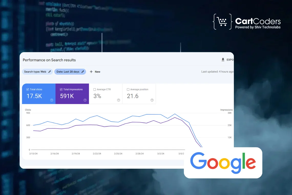
Checkout stands as the last step between interest and payment and it is also where most online stores lose sales. Data shows the worldwide cart abandonment rate is 69.82% and more than half of these exits occur due to checkout friction. Google data shows that a one-second delay during checkout cuts conversion rates by up to 20%, with mobile users affected the most.
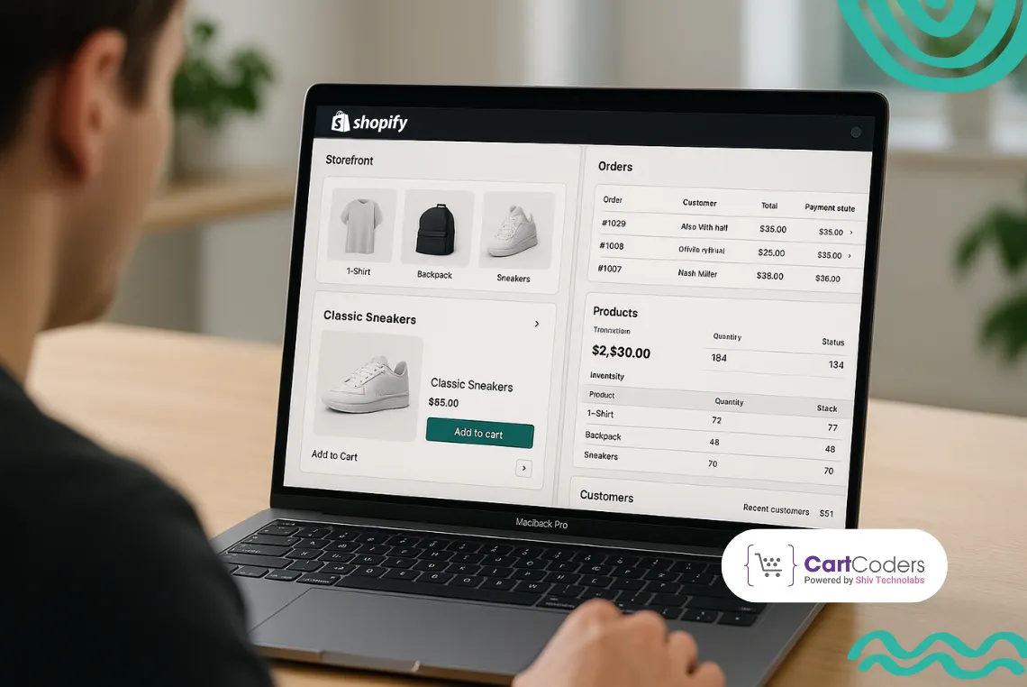
The standard Shopify checkout works well for early-stage stores but can feel limiting as traffic grows, product ranges expand and buying paths multiply. At that stage, Shopify headless checkout shifts from a tech change into a direct conversion driver.

This article explains what is Shopify headless checkout, how it runs behind the screen and why brands using it record better completion rates, quicker checkout speed and stronger mobile results. These insights come from real projects delivered by CartCoders, a Shopify development team building conversion-first headless commerce systems.
Standard checkout works fine when a store is small and traffic is predictable. Problems start when real buying pressure enters the system. Higher traffic, repeat visitors, mobile users and campaign spikes expose weak points in speed, clarity and flow. Checkout stops acting like a helper and starts acting like a barrier that slows buyers down.
Theme-based checkout depends on shared scripts, fixed layouts and limited speed control. As visitor numbers rise, these layers create delays, layout movement and blocked loading. Even a 500-700ms delay raises doubt and weakens trust. Mobile shoppers notice this instantly, which leads to more exits and unfinished payments.
Mandatory login, unclear delivery charges and stiff payment steps break buyer flow. Research shows that 26% of shoppers leave when account creation is required, while 21% exit due to surprise costs. Standard checkout offers little flexibility to reshape or tailor these steps, making improvement slow and difficult.

Headless checkout changes how checkout is built, not how payments are processed. Shopify still handles security and transactions, but brands gain control over how buyers reach that point. This separation allows faster pages, cleaner logic and custom flows without risking compliance or stability.
Shopify Storefront API and Cart API handle item selection, price rules, buyer identity and cart status. This setup lets brands shape every step of the process before payment without touching Shopify’s secure payment system. Speed, logic and personal touch improve while compliance stays intact.
A custom frontend built with React, Next.js, or Hydrogen manages the whole journey. When users are ready, they move to Shopify’s hosted checkout for payment. This maintains PCI compliance while giving full control over user flow.
Headless checkout creates one shared checkout logic across all entry points → website, mobile app, store kiosk, QR purchase and embedded flows. Buyers get the same experience no matter how they enter.
Conversion improvement does not come from persuasion or urgency. It comes from removing friction that slows confident buyers down. Headless checkout improves speed, clarity and flow, creating a smoother experience that feels easier and more trustworthy to complete.
Headless frontends remove theme clutter and unused files. API-based rendering reduces wait time between steps. Many brands see 10% to 30% faster checkout completion, which directly improves shopify headless checkout conversion results.
Custom rules allow removal of extra fields, hidden steps and manual typing. Guest buyers face simple forms. Returning buyers see saved details. Fewer inputs mean fewer exits.
More than 72% of ecommerce visits occur on mobile devices. Headless checkout supports mobile-friendly layouts, smart keyboards, address detection and step-by-step reveals. This aligns with mobile habits and lifts checkout success rates.
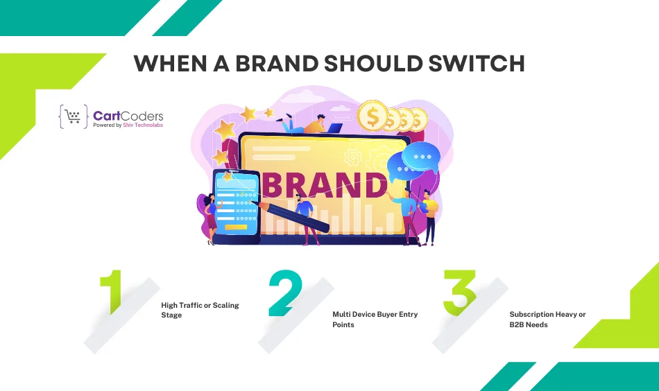
Headless checkout does not suit every store at every stage. The value appears when checkout friction starts costing real money. Knowing when to switch helps brands avoid overbuilding early and underperforming later when speed and flexibility become critical.
Brands crossing $50k+ monthly revenue often hit checkout speed limits. Traffic spikes magnify small issues. Headless checkout keeps speed steady during launches, offers, and viral surges.
When buyers arrive through apps, QR codes, social sales, or embedded widgets, standard checkout feels restrictive. Headless checkout aligns the experience across all touchpoints.
Recurring orders, contract pricing, bulk discounts and custom rules need flexibility. Headless checkout handles complex logic without slowing the flow.
These two approaches are often compared, but they address different layers of the problem. Shopify Plus improves checkout within Shopify’s system. Headless checkout changes how buyers reach the checkout page. Many brands misunderstand this difference and end up on the wrong path.
Shopify Plus supports checkout extensions and scripts inside Shopify’s system. It fits brands that want controlled changes without rebuilding frontend logic.
Headless checkout controls every step before payment. UX, speed and rules belong entirely to the brand. It suits speed-focused, mobile-led, or experience-driven businesses.
Many large brands use Shopify Plus with headless checkout together. Plus manages enterprise tools. Headless sharpens conversion paths.
APIs form the backbone of headless checkout. They replace theme-based logic with structured data flows. This allows consistent pricing, cleaner cart behavior and better handling of buyer identity without slowing down the experience or adding fragile scripts.
Storefront API manages cart setup, discounts, buyer identity and price checks. After final review, it creates a secure checkout URL for payment.
Headless checkout switches paths in real time. New users go as guests. Returning users see saved info. This flexibility lifts completion across user groups.
Checkout UX decides whether intent turns into revenue. Buyers arrive ready to pay, but even small points of confusion cause hesitation. Strong UX removes thinking, reduces effort, and guides users forward without pressure or distraction. Headless checkout gives the control needed to apply these rules properly.
CartCoders reviews goals before architecture planning.


Forced login creates mental resistance. Buyers see it as effort, not value. Data shows 26%+ leave when asked to create an account. The right rule is clear, which allows guest checkout first and offers account creation after payment. Headless checkout separates identity from payment, preserving speed.
Hidden costs break trust fast. Shipping, tax and fees must appear before payment. Strong UX shows full cost early, updates it live and avoids shocks. When buyers know the total upfront, confidence rises. Transparency is a conversion rule, not a design choice.
Over 70%+ of checkout traffic comes from mobile, yet many flows still copy desktop forms. Effective UX follows thumb zones, large tap areas, vertical layouts and smart keyboards. Numeric pads, address detection and less typing cut friction sharply. Headless checkout enables this without theme limits.
Showing everything at once overwhelms users. Progressive disclosure shows only what is needed at each step. Shipping first, payment next, optional fields last. This keeps mental load low and flow steady. Short forms feel faster even when total input stays the same.
Layout jumps weaken trust. Moving prices, shifting buttons, or changing layouts signal risk. Checkout UX must stay visually stable with fixed totals, steady CTAs and clear transitions. Headless checkout keeps rendering controlled, so users feel secure throughout.
Each step needs one main action. Extra links, banners, or menus dilute focus. The rule stays simple → one goal per screen. Headless checkout removes clutter and keeps intent clear.
Errors must appear as users type, not only after submission. Inline checks explain fixes clearly. Simple guidance lowers frustration and prevents exits. Fast feedback keeps users engaged.
Subscription checkout fails when control is limited. Buyers expect flexibility, clarity and easy management. Headless checkout supports these expectations without forcing users through slow or confusing steps, which directly improves retention and repeat purchases.
Headless checkout supports carts that mix one time buys with subscriptions in one flow.
Buyers manage pauses, skips and renewals easily. Control builds trust and raises lifetime value.
No system is perfect. Headless checkout introduces new technical responsibilities, but most issues are predictable and easy to solve with proper setup. Knowing these risks early prevents delays, trust loss and data gaps after launch.
Use branded subdomains and smooth transitions to keep trust intact.
Custom events must be mapped correctly to keep funnel data accurate.
Add token refresh logic to avoid expired carts.
Checkout improvements mean nothing without measurement. Clear metrics show whether changes help or hurt. Headless checkout allows deeper tracking, but brands must define success clearly and review results consistently.
Track checkout start against completion rate changes.
Review gains by device. Mobile usually shows the biggest lift.
Run parallel flows for clean testing and clear results.
Some situations show immediate gains from headless checkout. These cases usually involve speed pressure, repeat buyers, or complex catalogs where standard checkout slows confident users down.
Traffic spikes perform better with faster checkout flows.
Large selections feel smoother with custom rules.
Returning users finish faster with tailored flows.
CartCoders builds checkout first headless commerce systems that focus on revenue, not surface level design. Their approach treats checkout as the main growth lever rather than a final technical step.
Each project starts with checkout improvement, not visual polish.
Flexible setups using Hydrogen, Storefront API and selective headless layers cut cost while boosting results.
Brands receive a clear roadmap matched to traffic, complexity, and growth stage.
Headless checkout fits best when speed, catalog size, or mobile traffic makes standard checkout inefficient. It removes doubt, cuts friction and gives brands control over the buying path. The outcome is higher completion without discounts or pressure.
CartCoders focuses on Shopify headless checkout for ecommerce, delivering conversion driven systems that scale with confidence. From checkout only builds to full headless commerce, CartCoders helps brands unlock real revenue growth.
Ready to raise checkout completion by double-digit percentages?
Partner with CartCoders. Get a performance-driven headless checkout plan shaped around your traffic, products and buyers.
No. You can build a headless storefront on standard Shopify plans using the Storefront API. For checkout, most stores redirect customers to Shopify-hosted checkout for payment.
Yes, Many brands use Hydrogen only for cart and checkout, while keeping the rest theme based. This lowers cost and effort.
A checkout-focused headless build usually takes 3 to 6 weeks, based on integrations, subscriptions and tracking needs.
No, Payment options stay the same. Shopify continues to process payments securely through its hosted checkout.
Speed and clarity. Faster steps, fewer fields and clear fees create the strongest lift.

Projects delivered in 15+ industries.
95% retention rate, building lasting partnerships.


Serving clients across 25+ countries.
60+ pros | 10+ years of experience.


